
Lawn care / Brand & website
Lawn care.
A stronger
first impression.
Preferred Maintenance
of North Florida
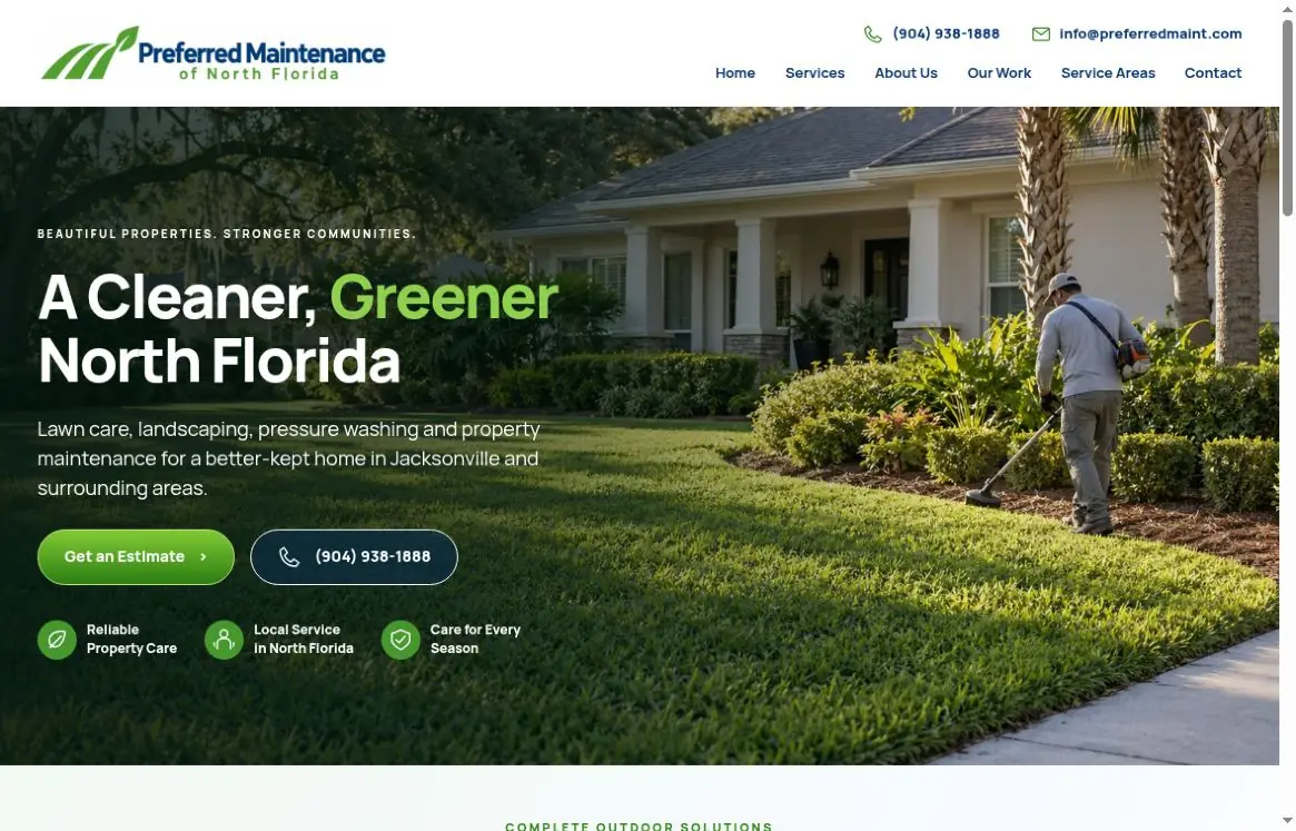
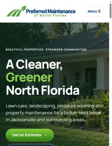
Actual homepage captures · October 2, 2026 · Device frames are presentation only
Lawn Care Website Design
Show your services.
Make contact simple.
A professional website for a lawn care or property maintenance business should make the work, service area, and next step clear.
Useful service pages
Explain your actual lawn care, landscaping, or maintenance offerings with accurate details and a clear structure.
A recognizable brand
Carry your approved logo, colors, and imagery consistently across desktop and mobile layouts.
Local information
Show the areas you truly serve and help visitors understand how to confirm availability.
Visible contact choices
Give visitors a straightforward route to your approved estimate request, phone number, or contact page.
A clean, confident presence.
Grounded in the work.
The website brings lawn care, landscaping, pressure washing, and property maintenance into one cohesive experience. A nature-led identity, direct service navigation, and visible estimate and phone options make the business easy to understand at a glance.
Lead with the place.
North Florida is part of the brand, from the company name to the regional headline and outdoor imagery.
Make the next step clear.
The homepage gives visitors distinct routes to explore services, request an estimate, or call the business.

Purposeful. Familiar.
Easy to recognize.
The lawn stripes and leaf symbol connect the identity to outdoor care. The blue wordmark supplies a steady visual anchor, while fresh greens carry the brand through the website’s buttons, highlights, and service details.
Homepage typeface
Clear, contemporary sans serif
Strong headings.
Comfortable reading.
Headings & identity
Primary accent
Fresh highlights
Body & contrast
Space & clarity
Built to feel right.
On every screen.
Desktop opens with a broad, visual introduction to the business. On mobile, the layout stacks into a direct reading path, with a compact navigation and prominent service and contact choices. The images below are captures of the actual homepage.
The homepage,
in detail.
Real screen captures from the current Preferred Maintenance build. Open each image to inspect it at its original size.
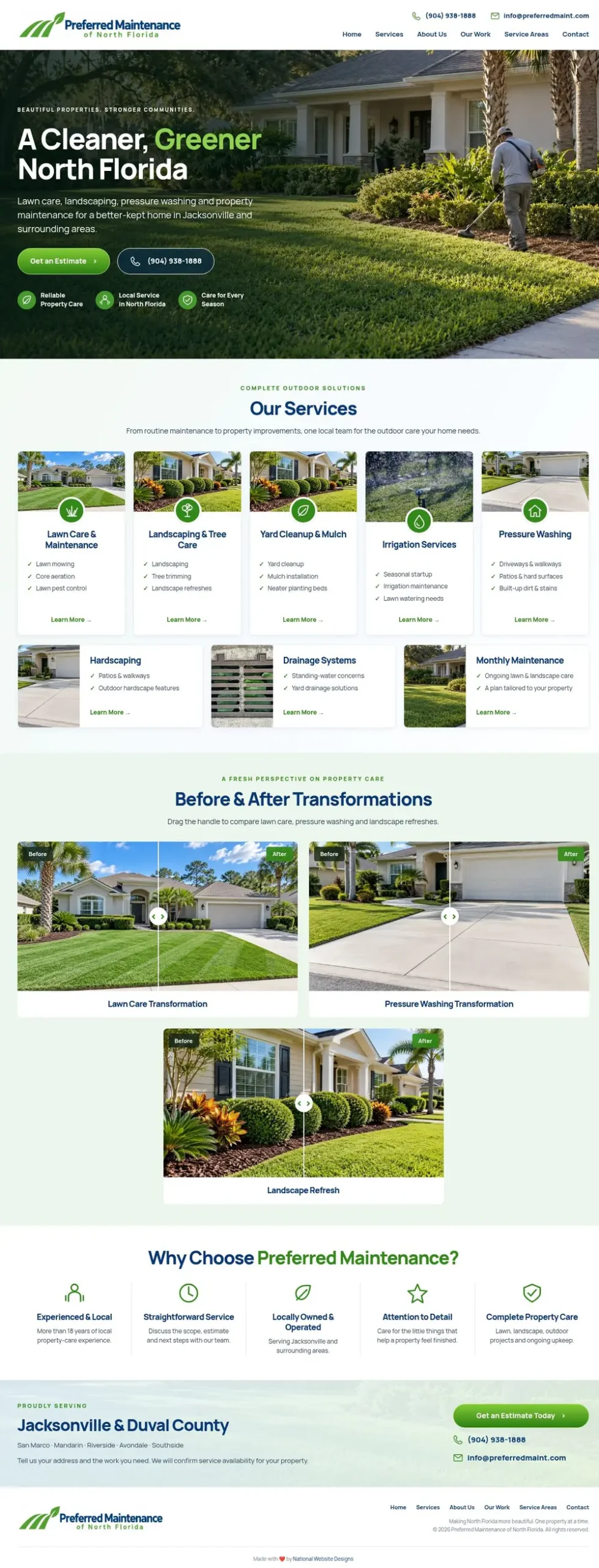
Open full homepage capture ↗
Open mobile capture ↗
Captured October 2, 2026 from the current WordPress build. The mobile image is a responsive browser-layout capture, not a physical-device test. Project imagery shown within the website is not presented here as verified before-and-after client results.
One connected visual language.
The approved logo, blue typography, and green accents repeat across the experience to create a recognizable system.
A clear path to the right service.
Service routes give lawn care, landscaping, and maintenance their own space while keeping the overall site easy to explore.
Visible ways to get in touch.
Estimate and telephone prompts are integrated into the page hierarchy. The case study focuses on the brand and website experience.
Explore the collection
A website shaped
around your business.
Return to the industry showcase to explore the other design directions in the collection.