

Apparel / Brand & online store
Apparel & Streetwear.
A stronger
first impression.
Cannon Movement
Premium training and streetwear
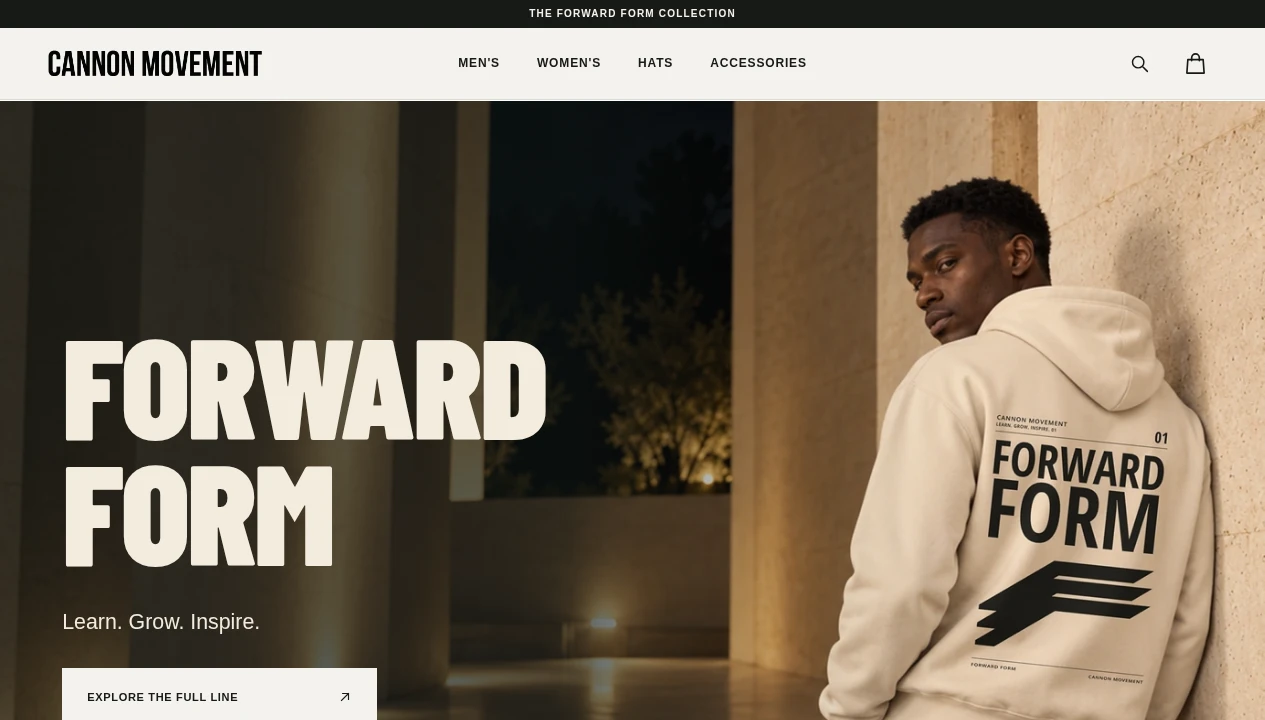
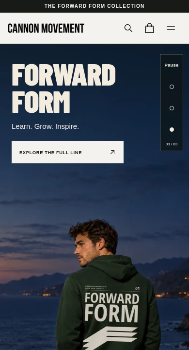
Actual homepage captures · October 11, 2026 · Device frames are presentation only
Designed around your business
Thoughtful design.
Practical details.
A focused starting point for your website, tailored to the products your business actually sells.
A bold brand presence
Pair your logo, type, and photography in one confident look that customers recognize at a glance.
Collections that are easy to shop
Organize your line into clear categories so customers get to the right piece fast.
Product images that carry the brand
Show each piece in a consistent, polished presentation that matches the feel of your brand.
A simple path to checkout
Guide visitors from the first look to the cart with a layout that stays clear on every screen.
A clear identity.
Grounded in the business.
Cannon Movement is a premium training and streetwear brand built around the idea of Learn. Grow. Inspire. Its website opens with a full screen hero for the Forward Form collection Website Design Fee cream and near black palette that lets the product photography lead.
What we built.
The homepage opens with a rotating hero that introduces the Forward Form collection and links straight to the full line. Clear navigation separates Men’s, Women’s, Hats, and Accessories, with a search field and cart always in reach. The narrow screen layout keeps the logo, cart, and menu at the top and keeps the hero message and button on the first screen.
Results.
The live homepage connects the brand, the collection, and the path to shop in one consistent presentation. Visitors can start from the hero or browse by category from the main menu. The captures document the current website experience. No verified sales, traffic, or revenue results were supplied, so no business improvement is claimed.
The identity,
as built.
The colors below come from the live website. They are a website palette, not a verified master brand specification.
cmclothingstore.com
Colors taken
from the current build.
Built to feel right.
On every screen.
The captures below show the actual homepage at desktop width Website Design Feet a narrow responsive width. The layout keeps the brand identity and the main contact path in view on both.
The homepage,
in detail.
Real screen captures from the current Cannon Movement website. Open each image to inspect it at its original size.
Open desktop capture ↗
Open narrow screen capture ↗
Captured October 11, 2026 from cmclothingstore.com. The narrow view is a responsive browser capture, not a physical device test. No business results were supplied, so none are claimed.
A recognizable palette.
The site builds its look from Cream, Olive black, and Stone gray, with a clear logo placement.
One layout, two screens.
The homepage reads in a clear order on desktop and on a narrow screen, with the cart and menu kept in reach.
An improvement worth making.
Keep the main shop button visible on the first screen at every width, so customers can reach the collection without scrolling.
Explore the collection
A website shaped
around your business.
Return to the industry showcase to explore the other design directions in the collection.