

Nonprofit / Brand & website
Nonprofit.
A stronger
first impression.
VisioNext
Enrichment Center
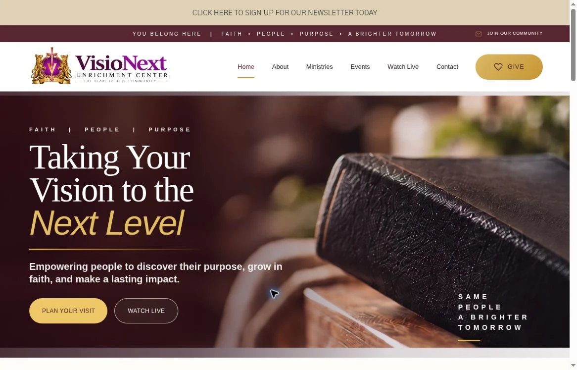
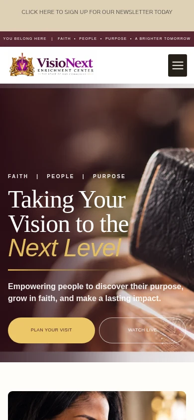
Actual homepage captures · October 3, 2026 · Device frames are presentation only
Designed around your business
Thoughtful design.
Practical details.
A focused starting point for your website, tailored to the information and services your business actually provides.
Mission-led storytelling
Put your actual mission, community, and programs at the center of the experience.
Visitor information
Make meeting times, locations, accessibility details, and contact information easy to find when relevant.
Programs and events
Organize current initiatives and events with accurate dates and clear participation information.
Ways to get involved
Create clear routes for volunteering, membership, contact, or an approved third-party giving platform.
A clear identity.
Grounded in the business.
VisioNext Enrichment Center presents itself as a community ministry in Jacksonville focused on faith, people and purpose. Its website introduces a mission of supporting personal growth and connecting the church community with local businesses and organizations.
What we built.
The homepage combines a welcoming introduction with a clear ministry overview and practical ways to get involved. Educational enrichment, youth empowerment, community involvement and outreach each receive a dedicated content card. Visit, livestream, giving and contact routes appear alongside the organization’s story and event section. Wine, gold and cream tones create a consistent identity across the logo, navigation, content sections and calls to action.
Results.
The live homepage presents the ministry’s purpose, areas of activity and visitor information in a connected experience. People can find contact details, service information and ways to explore involvement from the same page. The supplied captures document the current website presentation. No verified attendance, donation, volunteer, program impact or conversion results were supplied, so no measured organizational improvement is claimed.

The identity,
as built.
The logo and colors below come from the live website. They are a website palette, not a verified master brand specification.
visionextenrichmentcenter.com
Logo and colors taken
from the current build.
Built to feel right.
On every screen.
The captures below show the actual homepage at desktop width Website Design Feet a narrow responsive width. The layout keeps the brand identity and the main contact path in view on both.
The homepage,
in detail.
Real screen captures from the current VisioNext Enrichment Center website. Open each image to inspect it at its original size.
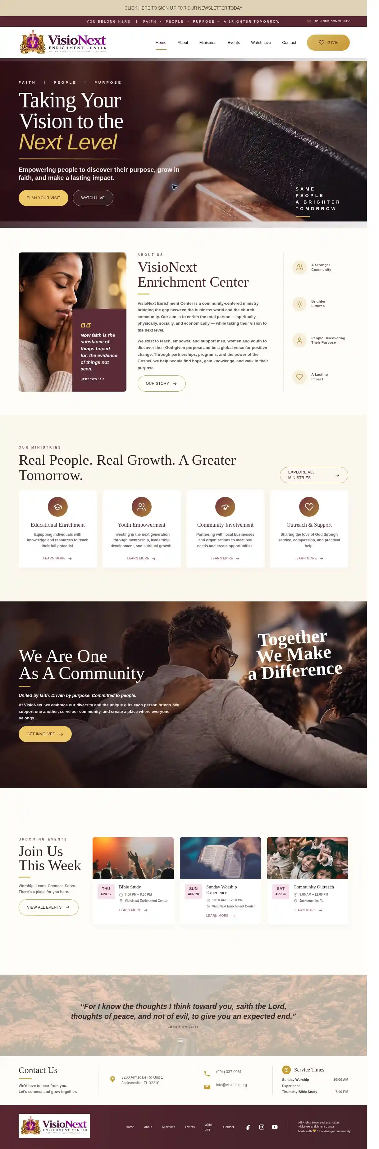
Open full homepage capture ↗
Open narrow screen capture ↗
Captured October 3, 2026 from visionextenrichmentcenter.com. The narrow view is a responsive browser capture, not a physical device test. No business results were supplied, so none are claimed.
A recognizable palette.
The site builds its look from Header wine, Homepage wine, Header gold Website Design Fee clear logo placement.
One layout, two screens.
The homepage reads in a clear order on desktop and on a narrow screen, with contact options kept in reach.
An improvement worth making.
Refresh the event cards with verified upcoming dates Website Design Feelign the ministries links to one consistent destination so visitors can find current information confidently.
Explore the collection
A website shaped
around your business.
Return to the industry showcase to explore the other design directions in the collection.